The right finish can make lipstick packaging look and feel more premium, but the finish must also work with the paperboard, printing process, and lamination method. Choosing the wrong combination can lead to scratching, poor adhesion, or an inconsistent appearance in production.
Color consistency is especially important when different finishes or materials are used on the same lipstick package. A brand may set a tight Delta E tolerance for critical colors, but the acceptable range should be agreed with the printer based on the substrate, ink system, approved color standard, and measurement method.
Why Lipstick Packaging Finishes Matter

Lipstick packaging finishes dictate first impressions, protect components from transit wear, and align the physical unboxing experience directly with the product’s price point.
Visual and Tactile Influence on Brand Perception
For lipstick products, the package is often the first physical interaction a customer has with the product, so its color, テクスチャ, and finish need to support the brand and shade presentation. In high-visibility retail environments, the surface finish of a lipstick carton or rigid box can play an important role in brand differentiation and the overall tactile experience.
- Shelf impact and light interaction: Glossy surfaces capture retail lights to build visual energy, while matte and satin options provide low-glare, modern minimalism.
- Tactile value and sensory branding: Soft-touch coatings, velvet finishes, and physical embossing satisfy consumer demand for high-end sensory cues when holding the tube.
- Coherence between finish and formula: Matching the packaging finish to the actual lipstick formula, such as pairing matte lipsticks with matte cases, establishes a unified identity.
When buyers touch a tube, they instantly judge its value. A well-chosen finish can make a standard carton feel more substantial and help the packaging match the product’s intended price positioning.
Structural Protection and Quality Control Standards
The finish also needs to withstand shipping, 取り扱い, and repeated contact during retail display. A premium-looking surface can still create problems if it scratches, 擦り傷, or loses adhesion before the package reaches the customer. Finishes must balance premium sensory design with robust mechanical defense and strict manufacturing tolerances.
- Defense against transit and retail handling: Protective UV coatings, ラミネート, and varnishes can improve resistance to scuffs, 傷, and ink transfer during shipping and handling.
- Strict color and finish consistency: Packaging suppliers use approved color standards and batch-matching procedures to maintain consistent color across production runs. For brand-critical colors, a tighter Delta E tolerance can be specified based on the substrate, ink system, and measurement method.
- Eco-friendly finishing alternatives: Modern designs integrate aqueous coatings and limit foil-stamped areas to satisfy recycling standards without losing premium aesthetic value.
Brands must demand verifiable testing for wear resistance. Enforcing a low color variance ensures that components produced in different batches match perfectly on the retail shelf.
フォイルスタンピング: A Premium Finish for Lipstick Packaging
Hot foil stamping applies precise heat and pressure to bond metallic layers onto lipstick packaging, creating high-contrast branding elements that elevate luxury shelf appeal.
Foil Stamping Parameters and Substrate Compatibility
Production engineers must control specific mechanical variables to transfer decorative foils without damaging the underlying packaging materials. Precise calibration prevents surface defects and ensures clean adhesion across different runs.
- Process temperature control: Standard luxury packaging runs between 120–160°C (248–320°F) to secure optimal adhesion without scorching paperboard substrates.
- Pressure and speed regulation: Consistent pressure prevents design voids, while slower press speeds ensure clean transfers of fine lines and typography.
- Finishing sequence optimization: Applying foil over a suitable matte surface can create a strong contrast between the low-gloss background and the reflective metallic detail. The final appearance depends on the foil type, substrate, ラミネート加工, and production sequence.
- Substrate compatibility guidelines: Coated paperboards provide the smoothest surface, but textured papers require pressure-sensitive foils to avoid cracking.
Aligning the temperature to the specific packaging material—whether thin folding board or heavy rigid box wrap—protects the tactile integrity of the paper fibers while ensuring the carrier film releases cleanly.
Foil Stamping Design and Quality Control
Translating digital designs into physical metal dies requires strict adherence to line-weight minimums and post-press inspection protocols to preserve brand asset integrity.
- Vector artwork specifications: Use clear vector artwork and avoid very small type or fine strokes in foil areas to maintain clean edges and legible details. The minimum type size depends on the font, artwork complexity, foil type, and supplier’s tooling capabilities.
- Visual quality inspection: Inspect foil edges and fine details under controlled lighting, using magnification where necessary to identify poor foil transfer, uneven edges, or unfoiled areas.
- Aesthetic color selection: Classic gold, 銀, and rose gold appeal to traditional heritage branding, while matte metallic and holographic foils capture modern trends.
- Safety and environmental criteria: For brands with sustainability requirements, foil coverage can be kept selective and the full packaging structure should be reviewed for recyclability and applicable chemical compliance requirements.
Maintaining these standards allows luxury beauty brands to deploy complex visual details safely, keeping the packaging fully recyclable without sacrificing the premium sensory impact.
Elevate Your Lipstick Packaging With Premium Finishes
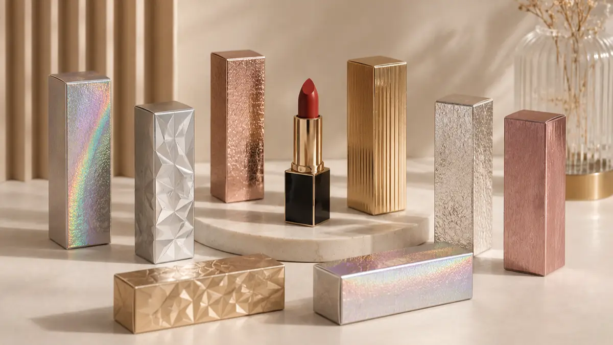
Embossing vs Debossing in Lipstick Packaging
Embossing raises designs for high-impact shelf presence, while debossing presses inward for minimalist luxury. Choosing between them dictates your tooling costs and paperboard thickness.
Tactile Branding and Visual Impact
Surface relief transforms a flat carton into a physical brand experience. The direction of the relief dictates how a package interacts with retail lighting and customer touch.
- エンボス加工: This technique creates a raised dimensional profile that catches overhead light to maximize shelf visibility, making it the default option for primary brand marks and crests.
- デボス: Pressing the design inward offers a restrained, architectural aesthetic that aligns with quiet luxury and minimalist collections.
- Blind finishes: Applying either technique without foils or inks provides physical depth while maintaining full packaging recyclability.
Brands targeting high-visibility retail spaces rely on raised elements, while boutique, clean-beauty lines prioritize recessed detailing to signal restraint.
Substrate Requirements and Production Cost Dynamics
Physical deformation of paperboard requires strict material specifications. If you run thin stock or choose the wrong tooling configuration, you risk splitting the fibers or ruining the reverse side of the packaging.
- Board Selection: Embossing works best when the paperboard has enough thickness and fiber strength to hold the relief without cracking or excessive show-through. The exact board specification depends on the depth, サイズ, and detail of the embossing.
- Tooling: Embossing normally uses a relief die with a make-ready or counter-die. The tooling setup becomes more demanding as the design becomes deeper or more detailed.
- Production Check: Ask the printer to test the proposed board and relief depth together before mass production, especially for fine logos or deep embossing.
- Debossing Plates: Debossing creates a recessed impression in the board and can produce a more restrained tactile effect than embossing. Tooling requirements depend on the depth, artwork detail, and board construction.
For high-volume production with tight budgets, debossing reduces upfront tooling investments. When using embossing on a folding carton, specify a paperboard heavy enough to mask the reverse-side impression.
Soft-Touch Lamination for Premium Lipstick Packaging
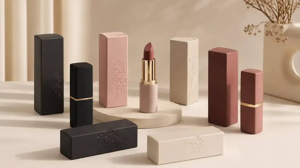
Soft-touch lamination applies a micro-textured polymer film to packaging, creating a protective, velvety matte finish that raises perceived product value for a few cents per unit.
Soft-Touch Lamination Materials and Application
Packaging teams use soft-touch lamination to upgrade standard paperboard with a premium tactile surface. We apply this protective layer directly to the printed stock before folding and die-cutting.
- Film Composition: Soft-touch lamination commonly uses a thin BOPP film with a textured matte surface. Film thickness varies by supplier and application, with 15–25 μm being a common range for packaging applications.
- Application Method: Manufacturers fuse this film to the paperboard after printing but before die-cutting, using controlled heat, プレッシャー, and thermal or UV-curable adhesives.
- Substrate Compatibility: Soft-touch lamination can be used on a range of coated paperboards, with the final board weight selected according to the carton structure, required stiffness, and finishing combination.
- Layering Versatility: Brands can apply other decorative finishes like hot foil stamping, スポットUV, and embossing directly over the laminated surface to create rich tactile and visual contrast.
This sequence ensures the decorative embellishments remain sharp and adhere permanently without peeling or lifting.
Soft-Touch Lamination Performance in Luxury Packaging
In prestige cosmetics, touch drives the purchase decision. A box that feels premium instantly shifts consumer expectations before they even open the product.
- Tactile Experience: The micro-textured surface creates a velvety, suede-like feel that increases consumer handling time and raises the perceived value of the product.
- Visual Behavior: The low-reflection matte finish diffuses light to reduce glare under retail spotlights, deepening printed colors for a highly sophisticated aesthetic.
- Physical Protection: The bonded film layer protects the underlying print against scuffs, 傷, fingerprints, and moisture during transport and repeated handling.
- Financial Premium: Soft-touch lamination can add roughly $0.08–$0.20 per unit on some packaging orders, but the cost of custom lipstick packaging also depends on carton size, coverage, substrate, 量, and supplier.
Spending a few extra cents on the finishing stage yields a high return on investment by justifying luxury price points on the retail shelf.
Spot UV vs Gloss Coating: Choosing the Right Lipstick Packaging Finish
Spot UV combines matte bases with high-gloss accents to signal prestige, while overall gloss coating maximizes shelf visibility and surface protection at a lower cost.
Visual Contrast and Luxury Brand Positioning
Brand owners choose between targeted contrast and complete reflectivity based on market tier. The choice dictates how a lipstick box behaves under retail lighting.
- Spot UV Contrast: A common approach is to combine a high-gloss spot UV area with a low-gloss matte or soft-touch background to create visible contrast. Exact GU targets should be set with the printer because the substrate and coating system affect the final reading.
- Overall Gloss Uniformity: Floods the entire carton to produce a mirror-like shine, which deepens color saturation and graphic sharpness for high-energy appeal.
- Luxury Tier Alignment: Prestige lines pair spot UV with matte bases to project quiet luxury, while mass-prestige brands use overall gloss for maximum shelf visibility.
Technical Performance, Registration, and Production Costs
High-end finishes introduce mechanical complexity. Managing tolerances during the press run prevents costly misalignments on small lipstick cartons.
- Registration Tolerance: For premium packaging, spot UV can be specified to around ±0.20 mm registration on suitable sheet-fed equipment, although achievable tolerance depends on the press, substrate, アートワーク, and production setup. Fine fonts under 8–10 pt or strokes under 0.5 mm need a 0.3 mm UV layer spread to prevent visible halos.
- Prepress Simplification: Overall gloss floods the entire sheet, completely removing registration errors and streamlining setup for complex patterns.
- Cost Premium: Spot UV generally costs more than an overall coating because it requires an additional finishing process and tighter registration control. The cost increase depends on coverage, artwork complexity, 量, and production method. We recommend reserving this for high-margin or limited-edition SKUs.
- Handling Durability: An overall gloss coating covers the printed surface consistently, helping improve resistance to handling marks and making the carton easier to clean during distribution and retail handling.
Metallic Paper and Specialty Stocks for Lipstick Packaging
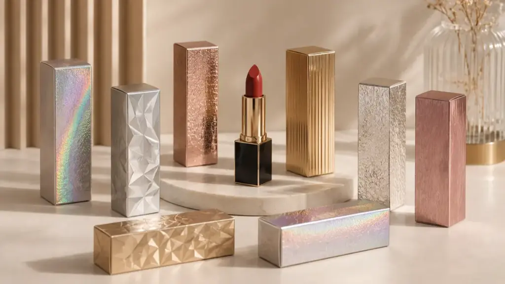
Metallic paperboards and specialty stocks combine decorative reflectivity with the structural properties of the selected paperboard. The final stiffness and durability still depend on board construction and caliper.
Material Characteristics of Metallized and Specialty Boards
Brands need packaging that survives global supply chains without losing its premium luster on store shelves. Metallized and specialty boards achieve this by merging mechanical durability with high-end surface aesthetics.
- Vacuum Metallization & ラミネート加工: Metallized paper can create a reflective appearance without relying on a separate decorative foil layer. Its performance still depends on the base paperboard and the metallized coating structure.
- Specialty Boards: Pearlescent, textured, and colored-through boards create tactile depth and a subtle shimmer, eliminating the unsightly raw white paper edges when consumers open the box.
- High-Caliper Paperboards: Using an appropriate board caliper and structure can reduce warping and help cosmetic cartons retain their shape during shipping, ストレージ, and retail handling.
Choosing the right board weight ensures the tactile feel matches the visual promise. A finish cannot compensate for a board that is too light or poorly suited to the carton structure.
Finishing Options and Circular Design Strategies
Achieving a premium finish requires precise ink control and strategic embellishment layering. Modern techniques allow brands to maintain high-shine aesthetics while meeting strict circular design goals.
- Reflectivity Control: White underprinting can be used selectively on metallic stocks to reduce the influence of the metallic background and improve color predictability.
- Multi-Layer Contrast: 箔押し, deep embossing, and spot UV varnishes create dynamic, light-reflective contrasts when layered on top of matte or velvet soft-touch coatings.
- Rigid Paper Tubes: Wrapping rigid paper tubes in metallic paper replaces plastic packaging with high-shine, paper-forward structures.
- Circular Design: Specifying FSC-certified fibers and choosing sustainable materials in cosmetic packaging can support more responsible carton design, while reducing foil coverage helps limit unnecessary decorative layers.
Limiting foil and other non-paper components can support recyclable carton design, but recyclability should be verified for the complete packaging structure and the relevant recycling system.
How to Combine Lipstick Packaging Finishes Effectively
Combining tactile and visual finishes can create stronger shelf impact, but the results depend on suitable material combinations, production sequencing, 色の一貫性, and finishing accuracy.
Brand Tier Recommended Finish Combination Critical Quality Metric Sustainability Strategy Prestige / Couture Soft-touch lamination with foil and deep embossing Color consistency and foil registration FSC-certified board where available; selective foil coverage Boutique Premium Soft-touch carton base with blind embossing and foil logo Adhesion and embossing definition Minimize unnecessary laminate and decorative coverage Modern Minimalist Matte or aqueous coating with selective foil or spot UV Coating uniformity and registration Prefer recyclable paperboard structures where validated
Strategic Decoration Pairings and Brand Tier Alignment
Brands can combine tactile and visual finishes to establish a clear visual hierarchy. 例えば, a hot-stamped metallic logo over a matte or soft-touch base can create a clear focal point without covering the entire surface with premium finishing techniques. Keeping the number of finishes controlled can also reduce visual clutter and help manage production costs.
- Prestige Lines: Pair deep embossing with metallic foil or specialty paper to create a more distinctive luxury effect on premium cartons.
- Modern Minimalist Tiers: Combine a matte or aqueous coating with selective hot stamping to create a clean appearance without excessive surface decoration.
- Sensory Classics: Use soft-touch carton bases with blind-embossed monograms, or combine a matte paperboard surface with selective foil details for a more tactile presentation.
Technical Production Requirements and Quality Control
Color consistency is especially important when multiple finishes or packaging components are produced for the same project. For brand-critical colors, the acceptable Delta E tolerance should be agreed in advance based on the approved color standard, substrate, ink system, and measurement method. This helps reduce visible color differences between cartons, インサート, and other printed components, particularly when matte and metallic surfaces are used together.
- Production Sequence: The production sequence should be planned around the selected materials and finishes. Depending on the construction, processes such as printing, コーティング, 箔押し, and embossing may be completed in different sequences to maintain adhesion, registration, and relief definition.
- Quality Testing: We run adhesion cross-hatch tests, wear resistance evaluations for handbag transport, and friction testing for e-commerce transit.
- Eco-Luxury Architecture: Choose recyclable aqueous varnishes over plastic laminations, and limit metallic foil to targeted spot areas to keep the packaging recyclable.
Custom Lipstick Packaging Finishes: Why Choose PACKCCP
Choosing the right finish is only part of the process. The manufacturer also needs to control the paperboard, 印刷, 仕上げ, サンプリング, and final inspection as one connected workflow. packccp provides factory-direct custom paper packaging for beauty and cosmetic brands, including 折り畳みカートン, 硬い箱, and premium finishing options such as hot foil stamping, エンボス加工, デボス加工, スポットUV, ソフトタッチラミネート加工, and textured papers. Its production process covers structure development, サンプリング, 印刷, 仕上げ, 品質検査, and bulk manufacturing in-house, helping reduce handoff risks between suppliers. PACKCCP also offers FSC-certified paper options and supports custom packaging development for international brands. For projects where color consistency, tactile finishes, and structural details all need to work together, a pre-production sample can help brands confirm the board, アートワーク, finish combination, and overall presentation before committing to mass production.
Choosing Lipstick Packaging Finishes by Brand Positioning
Matching your lipstick packaging finish to the brand’s price tier and sales environment helps create a more consistent product presentation.
Selecting Surface Treatments by Luxury Price Tier
The finish should reflect the product’s price positioning. A basic coating may suit an accessible line, while soft-touch, ホイル, or embossing can create a more premium presentation. If the visual cues do not align with the retail price, shoppers notice the disconnect instantly. Brands must match their decorative investments to their market tier to preserve margins while meeting buyer expectations.
- Accessible Prestige: Brands may use satin coatings, single-color metallic foil, and straightforward folding-carton structures to create a premium look while keeping finishing costs controlled. These selections deliver a premium look while respecting tight mass-production budgets.
- Core Boutique: Brands may combine soft-touch coatings, blind embossing, selective foil, and specialty papers to create a more tactile and distinctive presentation.
- Ultra-Luxury and Heritage: Brands may use heavyweight 硬い箱, multi-level embossing, metallic papers, and carefully registered foil details to create a more substantial presentation. These treatments transform a simple lipstick tube into a heavy, collectible keepsake.
Aligning Texture and Coating Strategies with Brand Persona and Retail Environment
The sales channel should also be considered when selecting a finish. Retail packaging needs to tolerate repeated handling, while DTC brands should test how metallic, マット, and glossy effects appear in product photography and online listings. Brands must align their aesthetic with both their ethical stance and primary sales channels.
- Clean and Sustainable Luxury: Brands favor matte UV coatings, water-based varnishes, and raw textured paperboards. These choices highlight ecological responsibility and raw, authentic minimalism.
- Glamorous, High-Energy Brands: Implement high-gloss varnishes, bold metallics, and high-contrast spot gloss. These finishes pop under retail lighting and stand out sharply in studio photography.
- Channel-Specific Performance: Retail environments require scratch-resistant, smudge-proof protective coatings to withstand constant handling. Direct-to-consumer (DTC) lines require light-reflecting metallics that translate effectively on mobile screens.
Common Lipstick Packaging Finishing Mistakes to Avoid
Poorly specified finishes destroy the tactile experience and structural integrity of lipstick packaging, turning premium concepts into cheap, non-functional, and unsellable inventory.
Aesthetic and Ergonomic Execution Errors
High-end aesthetics fall apart when brands treat surface decoration as an afterthought. Misjudging the interaction between textures, 文章, and base materials directly compromises how a product handles in real life.
- Over-decorated packaging: Competing finishes like full-coverage foil and heavy spot UV destroy the visual hierarchy, creating visual chaos instead of luxury simplicity.
- Compromised legibility: Low-contrast finishes or high-gloss varnishes applied over small branding, shade names, and regulatory copy render essential information unreadable.
- Poor surface selection: Excessively glossy coatings can create an overly slippery or fingerprint-prone surface on some packaging formats, making the package harder to handle and maintain.
- Substrate mismatch: Pairing premium hot stamping with lightweight, thin substrates creates a jarring physical feel that contradicts the luxury aesthetic.
A premium foil effect may have limited impact if the underlying board feels too light or does not provide the expected rigidity. Ergonomics and visual clarity must dictate the decoration layout.
Functional Incompatibility and Durability Failures
A finish must endure constant handling, transit friction, and chemical exposure from the cosmetic formula itself. Ignoring these mechanical and chemical realities leads to immediate field failures.
- Finishing on structural areas: Excessive coating, ラミネート加工, or decorative buildup near folds, 折り目, and glue areas can interfere with carton forming or assembly.
- Skipped environmental validation: Omitting wear testing allows metallic foils to tarnish and soft-touch laminations to peel when exposed to cosmetic oils.
- Uncontrolled color drift: Excessive color variation between the folding carton, 入れる, and other printed packaging components can create a visible mismatch in the final presentation. For critical brand colors, the acceptable Delta E tolerance should be defined during pre-production and checked against the approved color standard.
- Non-recyclable material layering: Applying multi-layer composites or plastic laminates blocks recycling pathways, instantly invalidating any eco-friendly claims.
Brands must validate every finish combination through strict environmental stress tests. Ensuring mechanical tolerances and chemical compatibility prevents costly product recalls and batch rejections.
Final Thoughts on Lipstick Packaging Finishes
Lower-cost finishing choices can reduce the initial packaging cost, but poor material selection or weak process control may result in peeling, color inconsistency, 引っ掻く, or poor surface adhesion. Clear manufacturing specifications, approved color standards, and appropriate wear, adhesion, and color checks can help reduce inconsistencies before a full production run. Investing in professionally engineered finishes ensures your physical packaging consistently matches the premium quality of your formula.
Before placing a full production order, request physical samples to check the board, surface feel, 色, foil adhesion, and overall finish combination. We recommend starting with a custom sample kit to test our soft-touch laminations, foil stamp tolerances, and structural paperboards firsthand. 今すぐ当社の梱包スペシャリストにお問い合わせください to review your OEM specifications and secure flawless execution for your next launch.