
Lar

>

Estudos de caso

>

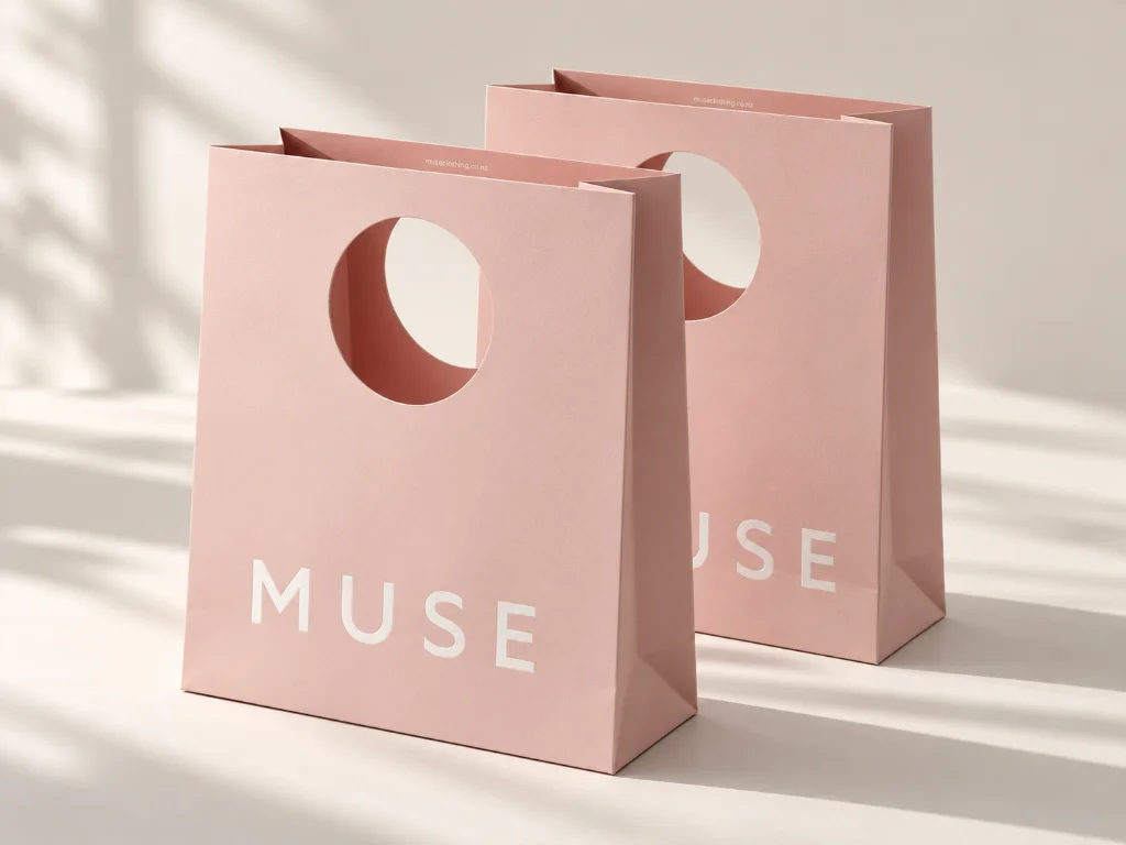
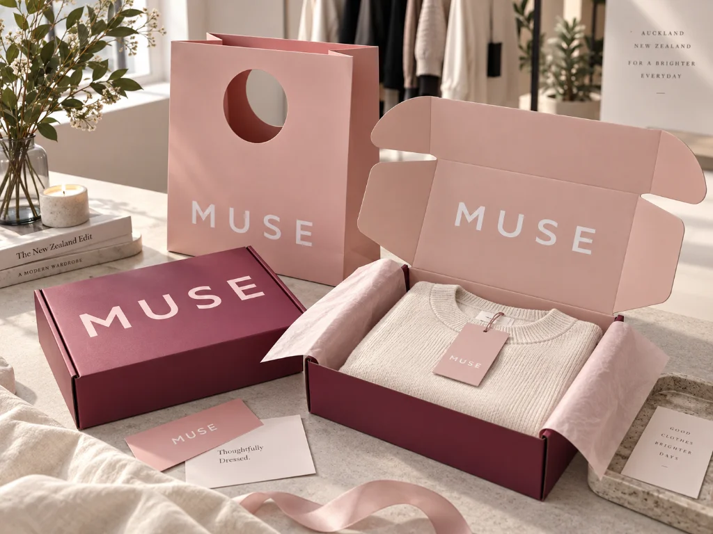
Cor correspondente da marca MUSE em caixas postais e sacos de papel premium

Cor correspondente da marca MUSE em caixas postais e sacos de papel premium

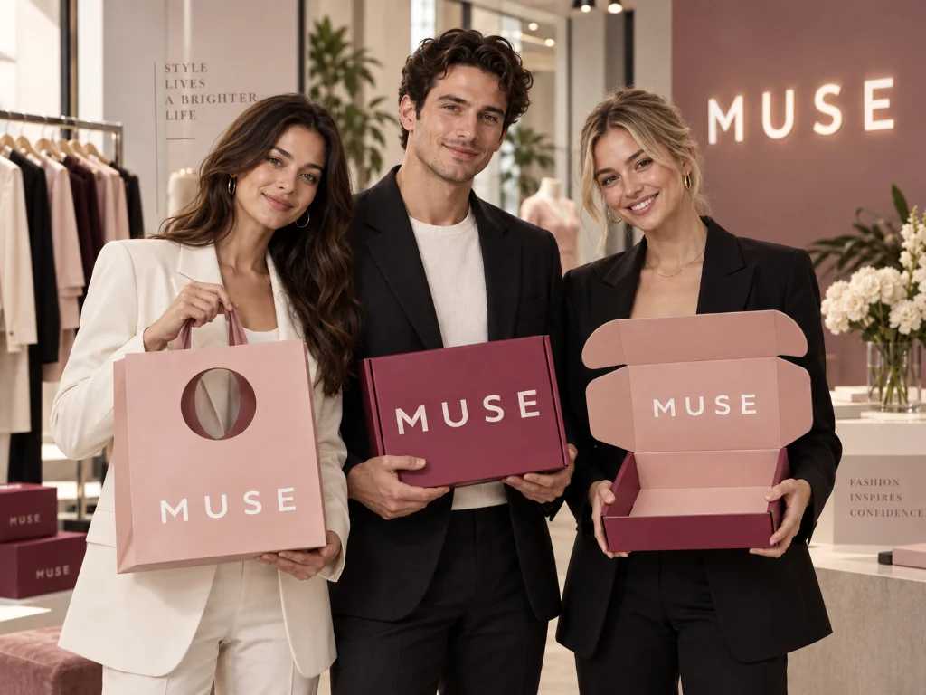
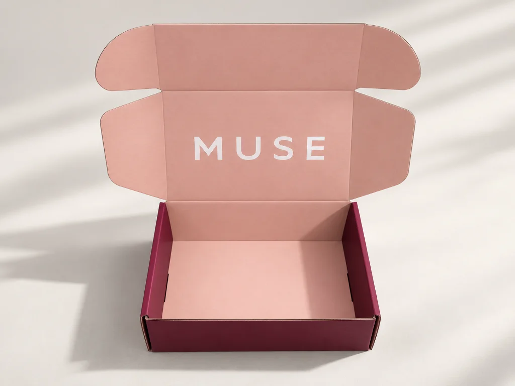
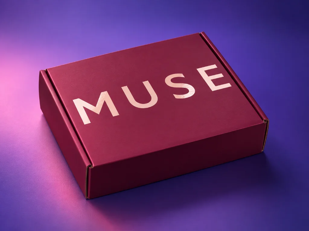
MUSE needed its corrugated mailer boxes and premium shopping bags to look like one packaging family, even though the two products used different papers and printing conditions. PackCCP controlled the project around one approved color reference, then used the finished mailer box as an additional production reference when printing the paper bags to keep the final set visually aligned.

Resumo do projeto

Cliente:
MUSE
Mercado:
Nova Zelândia
Indústria:
Moda & Vestuário
Produto:
Fashion Retail Packaging
Tipo de embalagem:
Caixa de correio, Saco de papel & Adesivo
Personalização:
Color Matching, Spot UV Logo, Embossed Logo
Material & Terminar:
Textured Specialty Paper, White Card + Placa de papelão ondulado, Pantone / CMYK Printing
Tempo de espera:
20 Dias
Consultor:
Doris
<span class ="tr_" id="tr_16" data-source="" data-srclang="zh-cn" data-orig="Table of Contents Sidebar">Table of Contents Sidebar</span>

00 Visão geral do projeto

MUSE wanted to upgrade its brand presentation with a coordinated set of mailer boxes, shopping bags, e adesivos. The main difficulty was not producing each item separately—it was keeping the same brand color visually consistent across a textured specialty paper bag and a white-card corrugated mailer. Because these two packages are used together, even a noticeable color shift between them would make the set feel disconnected. PackCCP therefore built the production sequence around color approval and cross-checking, while using Spot UV and embossed logo details to strengthen the final brand presentation.

01 Os desafios

Same Color—Different Paper Behavior

The paper bag used textured specialty paper, while the mailer box used white card laminated to corrugated board. Different surfaces can reproduce the same ink differently, so matching only by artwork values was not enough.

The Two Packages Had to Match Side by Side

The bag and box were designed to be used as one branded set. If one appeared warmer, darker, or more saturated than the other, the difference would be immediately visible when both were presented together.

Finishing Had to Support the Color—Not Fight It

MUSE also wanted the logo to stand out through Spot UV and embossing. These finishes needed to add contrast and tactile value while keeping the overall design clean rather than making the packaging look overworked.

02 Nossas soluções

We used one approved color reference throughout the project, then cross-checked the two packaging formats against each other during mass production.

Approving the Color Before Full Production

Before mass printing, PackCCP prepared the color for client approval. The approved color sample became the primary production reference, so the project did not rely only on digital artwork or screen color.

Printing the Mailer Box First and Using It as a Second Reference

The corrugated mailer box was produced first. After its printed color matched the client-approved sample, the finished box was kept as a physical benchmark for the next stage. When the paper bags entered mass production, the production team brought both the approved color sample and the finished mailer box to the press. The paper bag color was checked against both references during printing, helping reduce visible differences caused by the change in material.

Building the Brand Effect Through Paper and Logo Finishing

The paper bag used textured specialty paper, while the logo relied on embossed and Spot UV effects for added visibility. Instead of depending on heavy graphic decoration, the combination of controlled color, paper texture, and raised/gloss logo details created the premium presentation MUSE wanted.
03 Como executamos o projeto

Estágio

O que fizemos

Por que isso importava

Lock the Specification

o que

Confirmed box structure, bag structure, dimensões, Materiais, obra de arte, color direction, and logo finishing before production.

por que

Prevented color and finishing decisions from changing after the two packaging formats entered separate production processes.

Approve the Color Sample

o que

Produced samples for the client to confirm color, material, tamanho, and finishing before releasing mass production.

por que

Created one physical standard that both the mailer box and paper bag could follow.

Print and Cross-Match

o que

Produced the mailer box first, then used the finished box together with the approved color sample when printing the paper bags.

por que

Gave the production team two real-world references and helped keep the two materials visually closer.

Inspect and Ship

o que

Completed the 5,000-piece order, arranged third-party QC, and released the goods after inspection.

por que

Added a final independent checkpoint before the coordinated packaging set was shipped to New Zealand.

04 Resultado & Valor do cliente

5,000 Pieces Delivered in 20 Days — Followed by a Repeat Order

The most important control point happened during paper bag production: the team compared the bag not only with the approved color sample, but also with the already-finished mailer box.
Cor correspondente da marca MUSE em caixas postais e sacos de papel premium (8)

05 Resumo Técnico

Desenvolvimento Personalizado

Construído em torno das necessidades reais do produto

Validação de Amostra

Verificado antes da produção total

Controle de Produção

Principais detalhes monitorados por toda parte

Inspeção de Qualidade

Verificado antes
remessa

Suporte de entrega

Embalado e coordenado para envio

06 Estudos de caso relacionados

Histórias de sucesso de clientes

Mantenha-se informado com os últimos estudos de caso e avanços de nossa equipe.

Planejando o lançamento de uma embalagem em um cronograma apertado?

Ajudamos as marcas a passar do conceito à produção com menos riscos e mais certeza — independentemente do setor ou do cronograma.

Encomende agora

*Todas as suas informações são respeitadas & Protegido no packccp.