프로젝트 스냅샷
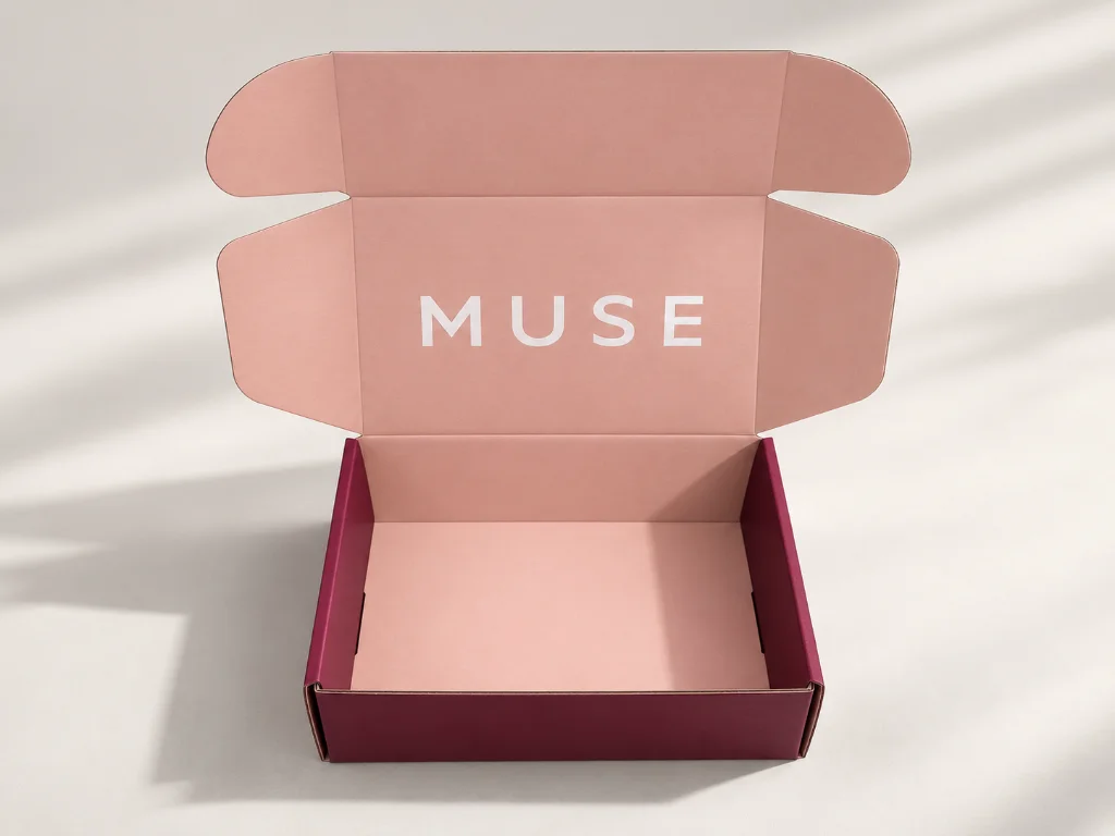
The paper bag used textured specialty paper, while the mailer box used white card laminated to corrugated board. Different surfaces can reproduce the same ink differently, so matching only by artwork values was not enough.
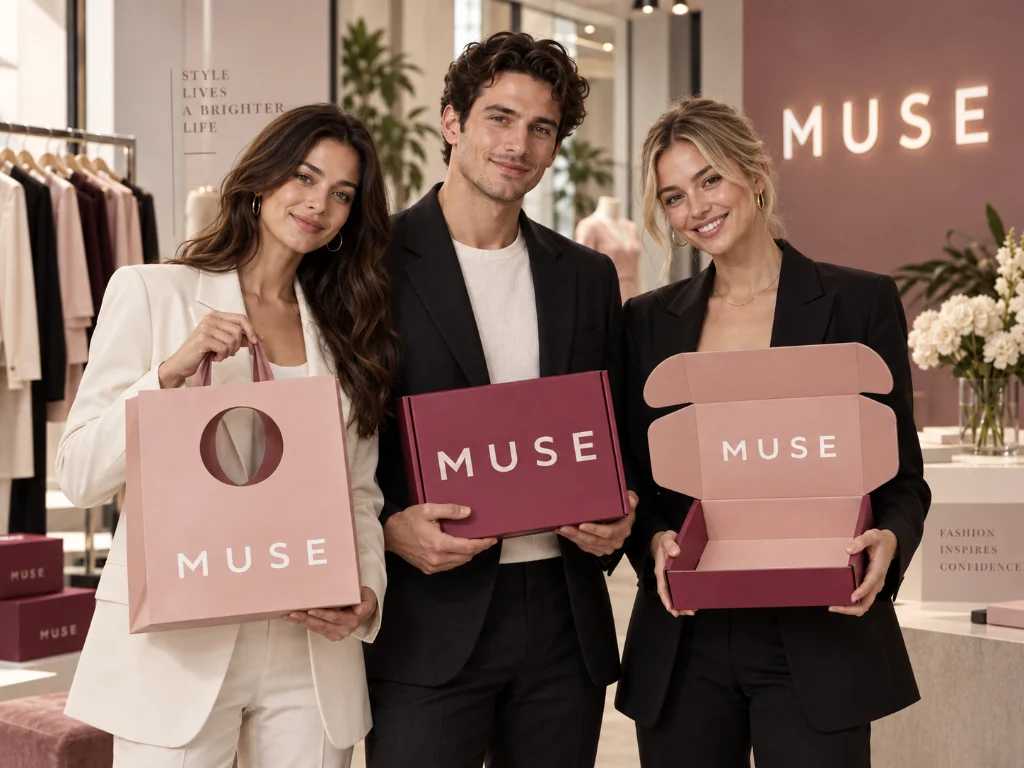
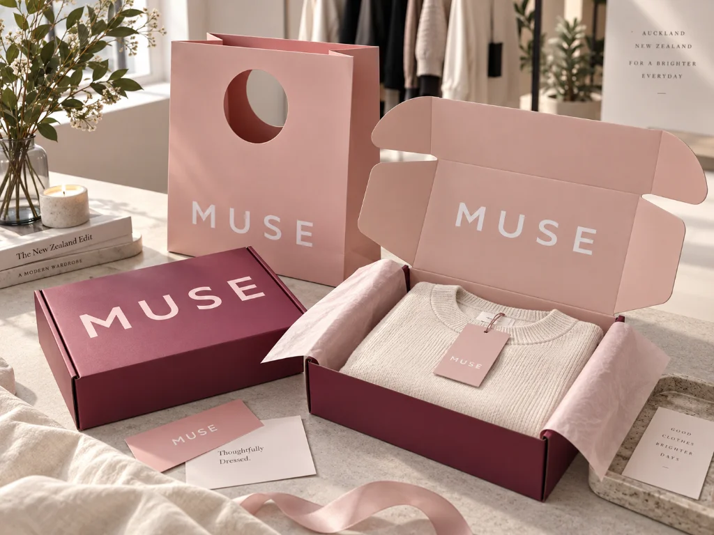
The bag and box were designed to be used as one branded set. If one appeared warmer, darker, or more saturated than the other, the difference would be immediately visible when both were presented together.
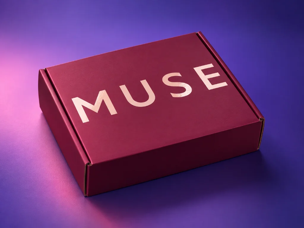
MUSE also wanted the logo to stand out through Spot UV and embossing. These finishes needed to add contrast and tactile value while keeping the overall design clean rather than making the packaging look overworked.
Before mass printing, PackCCP prepared the color for client approval. The approved color sample became the primary production reference, so the project did not rely only on digital artwork or screen color.
The corrugated mailer box was produced first. After its printed color matched the client-approved sample, the finished box was kept as a physical benchmark for the next stage. When the paper bags entered mass production, the production team brought both the approved color sample and the finished mailer box to the press. The paper bag color was checked against both references during printing, helping reduce visible differences caused by the change in material.
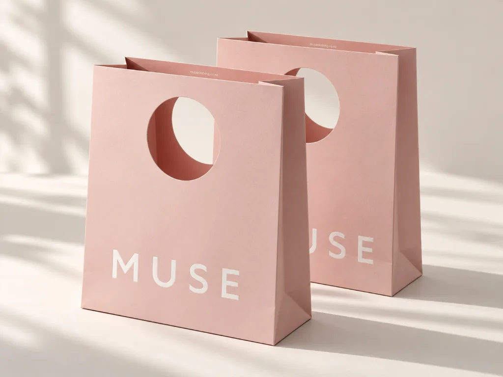
The paper bag used textured specialty paper, while the logo relied on embossed and Spot UV effects for added visibility. Instead of depending on heavy graphic decoration, the combination of controlled color, 종이 질감, and raised/gloss logo details created the premium presentation MUSE wanted.

Lock the Specification
무엇
왜
Approve the Color Sample
무엇
왜
Print and Cross-Match
무엇
왜
Inspect and Ship
무엇
왜
실제 제품 요구 사항을 중심으로 구축됨
전체 생산 전에 확인됨
전체에서 추적되는 주요 세부정보
이전에 확인됨
선적
배송을 위해 포장 및 조정됨
우리 팀의 최신 사례 연구 및 발전 사항에 대한 최신 정보를 받아보세요.
우리는 업계나 일정에 관계없이 브랜드가 위험을 줄이고 확실성을 높여 컨셉에서 생산까지 이동할 수 있도록 지원합니다..
*모든 정보가 존중됩니다 & PackCCP에서 보호됩니다.