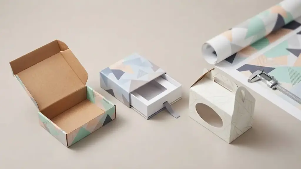
Poor artwork preparation can lead to misaligned folds, unreadable text, or other production problems. Using the approved dieline and checking bleed, safe zones, colori, and file settings before submission helps reduce the risk of costly reprints and production delays. This guide covers the main artwork requirements for lipstick box printing, including bleed, image resolution, color setup, linee guida, and file organization.
Lipstick Box Printing Starts with the Right Dieline
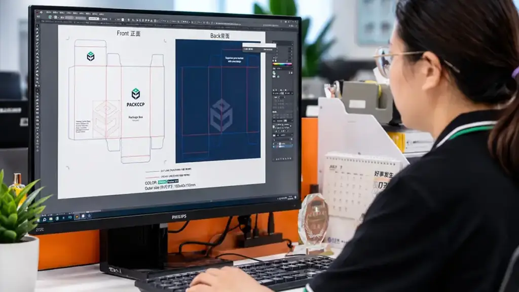
Never design a lipstick box on generic templates. Use the printer’s exact dieline and follow proper packaging dieline preparation to prevent crushed corners, misaligned graphics, and assembly failures.
Align Artwork to Structural Templates and Safety Margins
Because lipstick cartons have relatively small panels, even minor structural or artwork errors can become noticeable during folding and assembly. Whether you manufacture slim bullet casings, liquid lipsticks, lip crayons, or modern refillable components, your artwork must map directly to the final engineering template provided by your manufacturing partner and the selected folding carton style.
- Tube Compatibility: Match the structural template to the specific packaging style, whether a slim bullet, liquid tube, or a heavy-walled refillable case.
- Fold and Glue Integrity: Follow the approved dieline for fold lines and glue flaps so the carton can be folded and glued correctly during production.
- Safe Zones and Bleed: Keep all critical design elements inside the designated safe zone and extend backgrounds into the specified bleed area beyond the trim line. UN 3 mm bleed is common, but follow the printer-approved dieline if a different value is specified.
- Printer-Sourced Files: Use only the customized file from your direct print supplier, avoiding generic internet layouts that deviate from standard tolerances.
Designing without these custom dimensional guides causes immediate downstream issues. A millimeter of shift on a compact box will ruin the alignment of your front panel, rendering text unreadable or shifting branding into the fold lines.
Map Essential Regulatory Details and Manage the Proofing Flow
Because cosmetic cartons have limited panel space, required information needs to be planned early so it remains legible without overcrowding the design. Reserve clear, high-contrast areas for mandatory text during the prepress stage.
- Compliance Layouts: Map out space for shade names, INCI ingredients lists, codici batch, and scannable UPC or EAN barcodes on the back or bottom panels.
- File Formats: Package production files as high-resolution vectors in PDF, AI, or EPS formats, ensuring any raster imagery holds a minimum of 300 DPI.
- Color Space Rules: Specify Pantone spot colors for exact consistency across shade runs, and restrict CMYK to complex photographic elements or gradients.
- Verification Protocol: Use a 3D mockup to review panel layout and artwork orientation, then use a physical sample to check folding, fit, and final appearance before mass production.
Checking these details before prepress can help catch layout and file problems before production begins. Catching a misaligned fold on a physical sample is incredibly simple, while correcting it after a run of fifty-thousand units is impossible.
Print-Ready File Formats for Lipstick Box Artwork
We require PDF/X-4 or editable vector AI files for lipstick packaging to ensure sharp text, correct color separations, and error-free dieline alignment during prepress.
We establish vector formats as the baseline for structural packaging layouts. This practice ensures that cuts, pieghe, and branding elements remain perfectly crisp throughout the printing process and align exactly with the physical die-cutting equipment.
Primary Vector and Print-Ready Handoff Formats
- PDF/X-4 and PDF/X-1a: PDF/X-4 supports live transparency and modern color-management workflows, while PDF/X-1a uses a more flattened workflow. Check your printer’s file requirements before exporting the final artwork.
- Adobe Illustrator (AI) Source Files: Providing native AI files allows prepress operators to access and adjust structural dielines, margins, and vector assets directly without losing data.
- Vector Paths: All logos and small typography must use vector paths to maintain perfectly sharp edges across varying scale sizes.
Image Assets, Finish Separation, and Package Specifications
Cosmetic packaging often relies on a mix of detailed raster imagery and high-end specialty finishes. Structuring these elements correctly within your design files prevents misregistration and production delays.
- Photographic Elements: Use high-resolution PSD or TIFF files for photographic elements when the printer requests editable image files. Keep raster images at 300 DPI or higher at final print size.
- Font Outlines: Outline fonts in editable AI or EPS files when required by your printer. For print-ready PDFs, follow the printer’s requirements for font embedding or outlining.
- Specialty Embellishments: Use separate named layers and spot channels to isolate design elements for metallic foil, goffratura, and spot UV.
- File Hygiene: Remove low-resolution web images, screenshots, and office documents from the final handoff package to avoid automatic file rejection.
Premium Custom Packaging Built For Brands
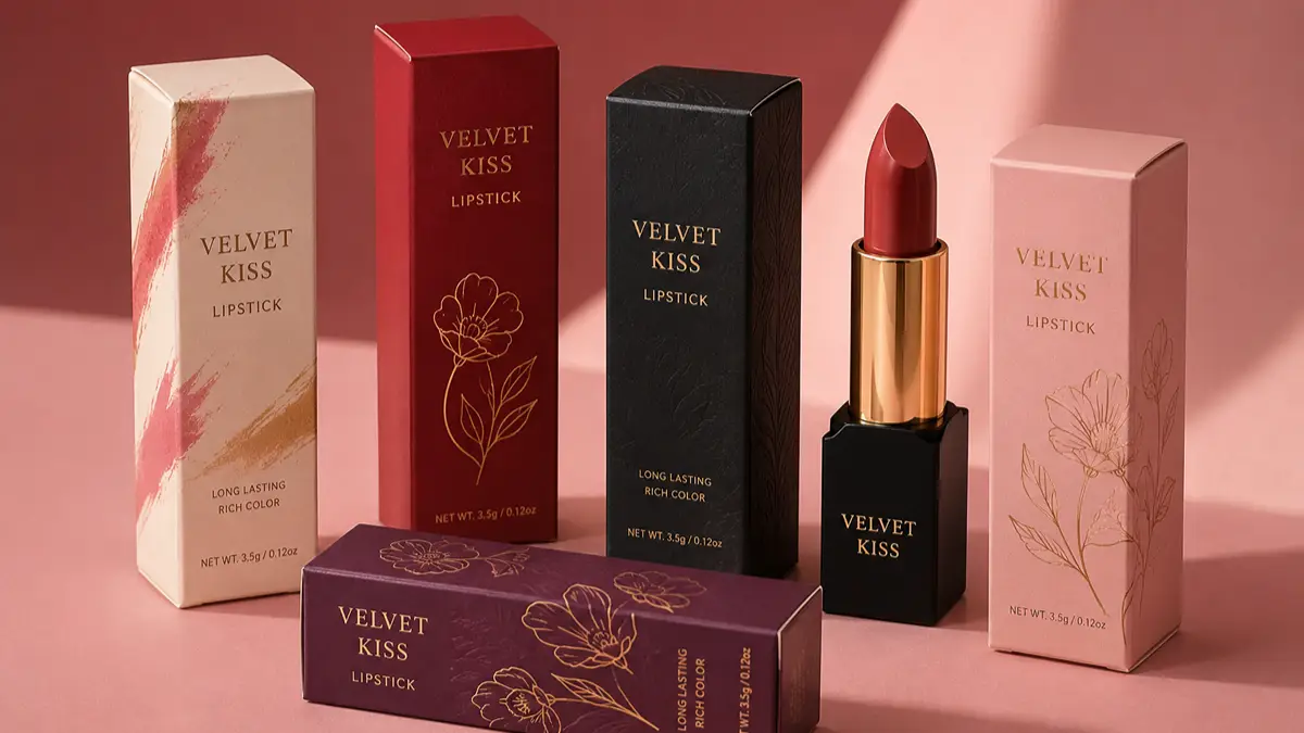
Choosing CMYK or Pantone for Lipstick Box Printing
CMYK handles complex gradients and photos efficiently, while Pantone guarantees exact brand color consistency across different packaging print runs.
Differences in Ink Application and Color Consistency
CMYK builds colors by layering tiny dots of cyan, magenta, yellow, and black. This process simulates complex gradients, photographic imagery, and realistic skin tones on the packaging surface.
Pantone uses single, pre-mixed ink formulas. This method prints solid, vibrant brand colors without relying on halftone dots, ensuring crisp, saturated results.
CMYK results can vary slightly between production runs because the substrate, press conditions, ink density, and calibration all affect the final color.
Pantone spot colors are useful when a brand needs tighter color consistency across repeat production runs. Final results can still vary with the substrate, rivestimenti, press conditions, and color-management process.
Guidelines for Setting Up Lipstick Artwork Files
- Hybrid setup: Use CMYK for photographic elements and background gradients, while assigning Pantone spot channels to brand logos and metallic borders.
- Color mode conversion: Convert all design files away from RGB before saving. This step prevents severe color shifts during the final separation process.
- Vector assets: Supply vector files for text and brand marks. Vector paths keep your lines sharp and readable on compact physical packaging surfaces.
- Physical proofs: Request physical press proofs on your chosen cardboard stock. Paperboard texture and coatings change how the stock absorbs ink, which alters the final visual output.
Bleed and Safe Zones for Lipstick Packaging Artwork
Bleed, trim lines, and safe zones help protect artwork from trimming and folding variations during carton production.
| Packaging Zone | Standard Dimension | Primary Function |
|---|---|---|
| Bleed | 3 mm (0.125 In) is common; follow the approved dieline | Extends background artwork beyond the trim area to prevent unprinted edges after trimming. |
| Trim Line | Exact final panel dimensions | Defines the absolute cut boundary of the finished carton. |
| Safe Zone | At least 3 mm inside the trim is a common starting point; follow the approved dieline | Keeps critical branding, typography, codici a barre, and regulatory copy away from trim and fold areas. |
Standard Dimensions for Bleed, Trim, and Safe Zones
Clear bleed, trim, and safe-zone boundaries are especially important on small lipstick cartons, where even small shifts can affect the final appearance. Even small shifts can become noticeable on a small lipstick carton, especially when text or decorative elements sit close to folds or edges. Use these structural parameters to anchor your layout:
- Bleed: UN 3 mm bleed is common for folding cartons, but always follow the bleed specified on the printer-approved dieline to prevent unprinted edges after trimming.
- Safe Zone Margin: Keep critical text, branding assets, codici a barre, and regulatory information at least 3 mm inside the trim line as a common starting point, unless the printer-approved dieline specifies a larger safe area.
- Trim Line: Treat this line as the absolute cut boundary representing the final visible face of your finished carton panels.
- Compact Lipstick Adjustment: On smaller cartons, consider keeping critical artwork farther from folds and edges when space allows, especially for small text, codici a barre, and fine decorative details.
Prepress Setup Rules and Design Safeguards
Before submitting the artwork, check the dieline, sanguinare, safe zones, and finishing layers against the printer’s production requirements:
- Full Bleed Extension: Extend all background colors, solid ink panels, modelli, and graphics to the outer edge of the specified bleed area. UN 3 mm bleed is common for folding cartons, but always follow the approved dieline.
- Dieline Layering: Place all cut paths and dielines on a dedicated, non-printing technical layer rather than flattening them with the printable artwork.
- High-Risk Keep-Outs: Keep brand names, shade names, ingredients, and barcodes away from high-risk folding paths, dust flaps, and glue seams.
- Embellishment Isolation: Keep spot UV, stampa a foglio, and embossing away from folds and trim lines to prevent varnishes from cracking or flaking during folding.
Artwork Resolution, Fonts, and Images for Lipstick Boxes
Prepress mistakes on small lipstick cartons ruin shelf appeal. Lock down your vector text, scale to 300 DPI, and respect the 3 mm bleed to prevent production misalignments.
Typography and Vector Text Specifications
Small lipstick cartons leave zero room for legibility errors. If small text prints poorly or fine lines disappear, important product information may become difficult to read and the finished carton may not meet the intended quality standard. You must optimize every typographic element for small-format physical print.
- Font Outlines: Convert all fonts to outlines or curves in your AI, EPS, or PDF files to stop font substitution and version mismatch errors at the press.
- Minimum Font Size: Use a font size that remains legible at the final carton size. For small regulatory text, confirm the minimum size with your printer and check the artwork on a full-size physical proof.
- Conformità normativa: Check the labeling requirements for your target market before finalizing artwork. For U.S. cosmetici, FDA rules specify minimum type sizes for certain required information, while EU rules require mandatory labeling to remain indelible, easily legible, and visible.
- Typeface Selection: Choose clean sans-serif fonts to ensure legibility at micro scales. Avoid thin, highly condensed, or decorative script fonts.
- Minimum Line Weight: Set all fine strokes, lines, and technical graphics to a minimum weight of 0.25 pt to prevent them from vanishing during print production.
Always check typography on a physical 100% scale mock-up. What looks legible on a massive studio monitor can easily turn into an unreadable block of ink when compressed onto a tiny 20mm carton panel.
Image Resolution and Artwork Layout Setup
Your digital artwork needs to account for the actual die-cutting, pieghevole, and printing process used to produce the carton. Low-resolution images and incorrect color modes create pixelated, off-brand packaging that buyers reject.
- Image Resolution: Use 300 DPI or higher for raster images at their final print size. Keep logos, testo, and other line artwork in vector format whenever possible.
- Color Mode: Build the artwork file strictly in CMYK color mode or specify exact Pantone spot colors, removing all RGB elements from the final document.
- Bleed Margins: Include a consistent 3 mm (0.125 pollice) bleed beyond the vector cutting lines on all outer edges of your template.
- Safe Zone: Keep critical branding, elenchi degli ingredienti, regulatory warnings, and other important artwork at least 3 mm inside the trim line and away from fold or glue areas, unless the printer-approved dieline specifies a larger safe area.
- Delivery Formats: Submit the final production files in high-resolution vector PDF, AI, or EPS formats with all assets properly embedded or linked.
Background graphics must spill completely over the trim edge into the bleed zone, while critical copy must retreat into the safe zone. This layout logic protects your design from the natural shifting tolerances of the industrial die-cutter.
How to Prepare Finishing Layers for Lipstick Box Printing
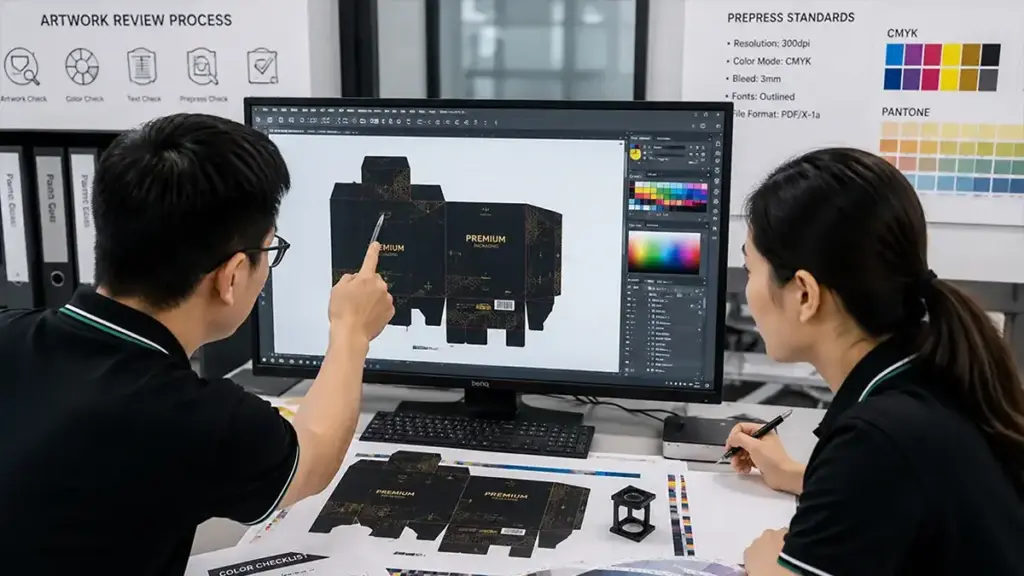
Setting up custom finishes on isolated vector layers with precise alignment and correct overprint settings prevents production errors and ensures a premium cosmetic packaging result.
Placing high-end finishes on a single flat artwork layer destroys prepress workflows. Packaging manufacturers require isolated vector paths to produce the physical dies and plates for foil stamping, goffratura, and spot UV.
Vector Layer Configuration and Overprint Settings
Designers must construct digital mechanicals with production-specific layers to separate ink from specialty finishes. This structural separation keeps your files compatible with modern plating and die-making equipment.
- Layer Isolation: Isolate each decorative finish on its own dedicated vector layer positioned directly over the corresponding print artwork.
- Typography and Formats: Convert all typography to outlines and use solid spot-color vector shapes instead of raster formats like JPEG or PNG.
- Overprint Attributes: Set up spot UV, sventare, and embossing elements as separate production layers and follow your printer’s requirements for spot colors, overprint, and knockout settings.
Failing to select overprint tells your design software to knock out the artwork beneath the finish. This leaves ugly white halos around your embellishments if the printing press registration shifts even slightly during the run.
Technical Tolerances and Structural Alignment
Cosmetic packaging requires tight physical tolerances due to its compact size. Because lipstick boxes are small, minor shifts during die-cutting or folding can ruin the visual alignment if you position embellishments too close to structural boundaries.
- Foil Specifications: Follow the printer’s minimum line width and spacing requirements for foil elements. Small foil details generally require more clearance to avoid filling, merging, or registration problems.
- Spot UV Tolerances: Set spot UV shapes to a minimum thickness of 0.2 mm and keep these coatings away from score lines to avoid cracking.
- Structural Alignment: Align all embellishments precisely with the structural die-line, ensuring safe clearances near edges and folds to prevent peeling.
Cracked coatings and peeling foil look cheap on retail shelves. Keeping these premium finishes clear of the creasing rules protects the package integrity when the machine folds the flat paperboard carton into its final three-dimensional shape.
Barcode and Regulatory Artwork for Lipstick Packaging
Planning barcode and regulatory zones directly on the custom dieline prevents scanning errors, preserves design aesthetics, and guarantees compliance on small cosmetic cartons.
Barcode Design Specifications and Placement Rules
Retail packaging needs a barcode that can be scanned reliably at the point of sale. On a small lipstick carton, placement, contrast, quiet zones, and print quality all affect barcode readability. We enforce strict parameters for size, quiet zones, and ink contrast to avoid costly retail rejection.
- Format & Sizing: Select the appropriate UPC-A or EAN-13 format and size it according to the current GS1 specifications for the symbol type and X-dimension.
- Surface Selection: Position the barcode on a completely flat, non-curved area of the back panel, avoiding package flaps, seams, pieghe, and structural closures.
- Quiet Zones: Leave the required clear space around the barcode according to the barcode type and GS1 specifications. Keep logos, borders, textures, and other artwork outside the quiet zones.
- Edge Clearance: Maintain the GS1-specified edge clearance, keeping the barcode symbol between 8 mm e 100 mm from any outer edge of the folded carton.
- Contrast Control: Print the barcode using black bars on a solid, high-contrast white or light background, avoiding reflective finishes, metallic inks, varnishes, or gloss laminations in the scanning field.
- Scan Validation: Validate scan performance on physical, true-to-size printed mockups using retail-grade scanners rather than relying solely on flat digital proofs.
Regulatory Panel Layout and Compliance Standards
Cosmetic labeling laws demand specific placement and font sizes for required copy. Managing these details early protects the brand’s visual identity while meeting legal requirements. We map out all mandatory details on dedicated informational panels during the initial prepress stages.
- Net Quantity Placement: Place the net quantity statement on the principal display panel as required for the target market, and verify its size and placement against the applicable labeling regulations.
- Panel Partitioning: Establish a clear structural panel strategy, dedicating the clean front panel to branding and using the back or side panels for ingredients, warnings, and company information.
- Text Scale Verification: Confirm all mandatory text sizes meet regional legal requirements on the actual carton scale before final artwork sign-off.
- Safe Zone Mapping: Map out regulatory safe zones on the digital dieline to ensure folds, glue flaps, and structural seams do not slice through ingredients lists or allergen warnings.
- Variable Data Fields: Reserve a dedicated, unvarnished zone on the artwork for variable production codes, such as batch numbers and expiration dates, to prevent smudge issues during inline printing.
- Three-Dimensional Assembly Check: Perform a physical assembly check on a pre-production sample to ensure no critical regulatory data becomes hidden once the carton folds into its final shape.
Lipstick Box Printing Prepress Checklist
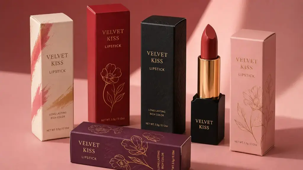
Verify dielines, colori, and layers before submitting final files. Small layout shifts on compact lipstick boxes ruin branding and prevent scan compliance on retail shelves.
Artwork Design and Color Specification Setup
Compact cosmetic packaging leaves zero margin for layout errors. Preparing artwork requires strict alignment with the physical limits and folding geometry of the custom carton.
- Dieline Alignment: Align all artwork assets to the manufacturer’s approved dieline, keeping critical content inside the specified safe zone and extending backgrounds through the full bleed area.
- Typography Outlines: Convert all text and typography to outlines or vector paths to prevent font substitution issues during printing.
- Color Space Conversion: Set the document color space to CMYK, convert all RGB images, and identify any custom spot colors or rich black settings clearly.
- Image Resolution: Ensure all linked raster graphics maintain a resolution of at least 300 DPI at final print size to prevent pixelation.
- Embellishment Isolation: Place specialty embellishments like spot UV, stampa a foglio, or embossing on separate, clearly labeled design layers.
Setting up these parameters early prevents press operators from misinterpreting design intent and ensures spot finishes align with CMYK plates.
File Export and Preflight Verification
Exporting files incorrectly can flatten critical spot-color channels or drop high-resolution assets. Systematic preflight checks catch structural errors before they trigger costly press stops.
- File Packaging: Package the native design files to include all active fonts, linked assets, and color profiles, or export a high-resolution, print-ready PDF using the required printer preset.
- Preflight Check: Run an automated preflight check to flag and resolve transparency issues, missing fonts, or low-resolution image warnings.
- Fold Alignment: Verify folding alignments so critical text or branding does not overlap panel creases, glue tabs, or tuck-flap seams on the physical lipstick carton.
- Pasteboard Cleanup: Clear all unused color swatches, stray vector paths, and non-printing design notes from the digital pasteboard before packaging.
- Dimension Matching: Compare the final digital proof layout against the physical dimensions of the approved lipstick box specifications.
A mismatch between flat digital files and the physical folding sequence results in split text or blocked glue seams. Correcting these tolerances during prepress ensures the carton folds cleanly without graphics bleeding into seams.
Custom Lipstick Box Printing with PackCCP
Preparing accurate artwork is only one part of producing reliable lipstick packaging. PacchettoCCP supports brands from artwork review and structural sampling through custom production, with engineering and manufacturing experience built over 20 anni. All production is completed in our own factory, with more than 80% of production processes automated and every finished product inspected before shipment. Samples can typically be completed within 3–7 days, while standard high-volume orders can be completed within 15 giorni. We also offer custom paper packaging made with recyclable and sustainable material options, including FSC-certified paper where applicable. Our team provides direct communication throughout the project, with global customer support responding within two hours. Whether you need a simple lipstick carton or a more customized structure with specialty finishes, PackCCP can help review your dieline, opera d'arte, materiale, and finishing requirements before production begins.
Lipstick Box Printing Artwork FAQs
What file format should lipstick box artwork use?
Submit artwork in a print-ready vector format like PDF, AI, or EPS. Vector-based PDFs exported from Adobe Illustrator are the safest default because they preserve sharp text and dielines. You can use raster formats like TIFF, PNG, or JPEG for image elements, but keep them at a minimum resolution of 300 DPI at the final print size. Set the color mode to CMYK and include a 3 mm (0.125 In) bleed on all sides.
What is a dieline and why is it important for lipstick boxes?
A dieline is a flat technical template showing where the printer cuts, pieghe, pieghe, and glues the lipstick box to assemble it into its final 3D shape. Because lipstick boxes are small, even a minor layout mistake shifts critical text or logos onto a fold or gets them cut off. Designers use the dieline to position artwork correctly on the active panels while keeping safety margins clear of seams.
How much bleed is required for printing lipstick packaging?
UN 3 mm (0.125 In) bleed is common for folding cartons, but the exact requirement should come from the printer-approved dieline. Extend all background colors, modelli, and images into the specified bleed area to prevent unprinted edges after trimming.
Should fonts be outlined before submitting the packaging file?
For AI or EPS source files, outlining fonts can prevent font-substitution problems. For print-ready PDFs, however, font outlining may not be necessary if the fonts are correctly embedded. Always follow the packaging manufacturer’s file-preparation requirements.
Should I design my lipstick box in CMYK or RGB?
For most conventional lipstick box printing, prepare the final artwork in CMYK and specify any required Pantone spot colors. Check your printer’s color-profile and PDF/X requirements before export, especially when the design contains specialty inks or finishes.
When should I use Pantone spot colors instead of CMYK?
Use Pantone spot colors when you need tighter brand-color consistency across repeat production runs, especially for solid brand colors and logos. Final color results can still vary with the substrate, rivestimenti, press conditions, and color-management process.
How do I prepare Spot UV files for my packaging design?
Create a separate, dedicated layer or mask file named “Spot UV” O “Varnish” directly above your CMYK artwork. Isolate the specific design elements that require the gloss coating, fill them with a solid spot color (often 100% K black), and leave all other areas blank. Keep these UV elements clear of folds and cuts to prevent the varnish from flaking.
Does metallic foil artwork need a separate layer?
SÌ, place all foil artwork on a dedicated, clearly labeled vector layer above the main CMYK print layer. Label it clearly, ad esempio “Gold Foil” O “Foil.” Use a solid 100% spot color with no gradients or raster effects, as the printer uses this layer to manufacture the physical metal die for hot stamping.
What is the minimum image resolution for lipstick packaging?
All raster images, foto, or textures must have a minimum resolution of 300 DPI at their final print dimensions. Low-resolution images (like 72 DPI or 150 DPI) print with blurry edges or pixelation. For the sharpest results on small cosmetic boxes, use vector artwork for all text, codici a barre, and logos.
Where should the retail barcode be placed on a lipstick box?
Position the barcode on a flat, smooth panel, preferably in the lower right area of the back panel. Avoid placing it across seams, pieghe, or folds, which can distort the lines and cause scanning failures. Ensure you preserve the recommended blank quiet zones on the left and right sides of the barcode.
What causes misalignment issues during the printing process?
Misalignment typically stems from using an incorrect dieline template, failing to include a bleed, or placing text too close to folds. Physical shifts on the press, substrate stretching, or mechanical drift between color plates can also cause registration errors. You can prevent these issues by building your artwork on a separate layer using the printer’s official dieline and running physical proofs before the full production run.
What files do I need to send to the packaging manufacturer?
Send a print-ready PDF in the printer’s required PDF/X format, with the correct color space, sanguinare, linea die, and embedded or outlined fonts according to the manufacturer’s specifications. Include high-resolution images and editable AI or EPS source files when requested.
Considerazioni finali
Generic templates can create problems when their dimensions do not match the final carton. Using the manufacturer’s approved dieline and checking the artwork during prepress helps reduce the risk of misaligned graphics, folding problems, and barcode issues before mass production. Your packaging is one of the most visible parts of the finished product, so artwork accuracy matters just as much as the visual design.
Avoid leaving physical assembly and color accuracy to guesswork on a computer screen. We suggest starting with a custom structural sample to test the fit and finish of your lipstick packaging before committing to a full production run. Contact our packaging engineers today to secure your custom dielines and review your technical specifications.