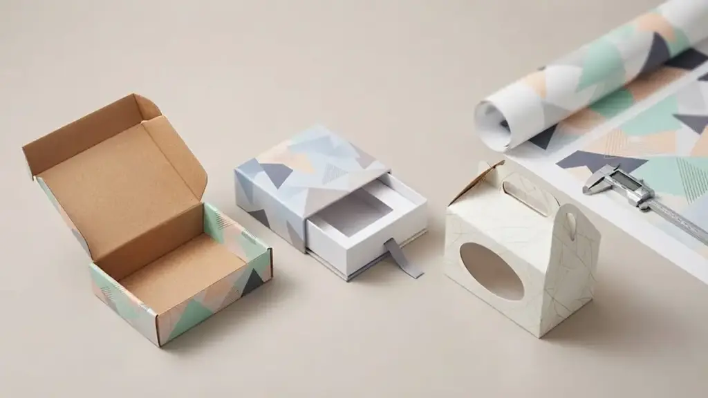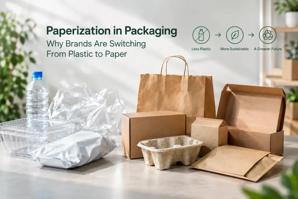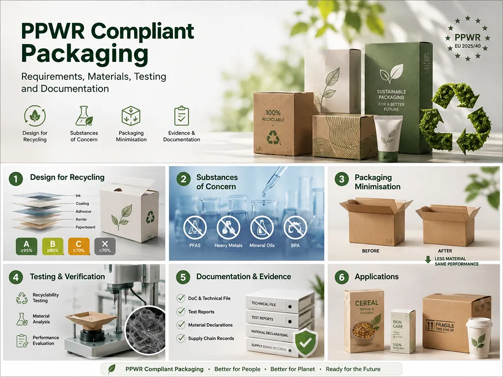
잘 팔리는 고급 화장품 포장을 디자인하려면 매력적인 시각적 요소 그 이상이 필요합니다.. Brands need to balance premium materials, structural protection, 인쇄 품질, and production costs to create packaging that strengthens product value without increasing unnecessary expenses.
This analysis benchmarks high-end packaging systems against prestige beauty standards. We evaluate structural specifications such as 1200–1500 GSM rigid chipboard, premium finishing options, and production considerations that influence luxury packaging performance and cost efficiency.
What Makes Luxury Cosmetic Packaging Stand Out
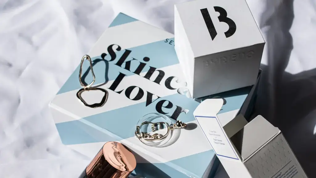
True luxury packaging blends heavyweight materials, precise manufacturing tolerances, and sensory details to justify premium pricing while protecting high-active formulas.
Luxury beauty starts with structural substance. Brands prioritize raw material integrity over cheap surface treatments to signal value before a customer even applies the product.
Material Integrity and Precision Engineering
The foundation of any high-end cosmetic package lies in the quality of its materials, structural precision, and manufacturing consistency. These specifications separate prestige lines from mass-market alternatives:
- Premium Structural Materials: Rigid boards, textured papers, molded inserts, and specialty papers create a substantial hand-feel while protecting cosmetic products during storage and shipping.
- Precision Manufacturing: Accurate die-cutting, 접는, and assembly processes ensure clean edges, 일관된 차원, and reliable performance across customized packaging structures.
- High Investment Level: Premium beauty brands usually invest more in packaging development, custom structures, and finishing processes because packaging plays an important role in perceived product value.
- Active Formulation Protection: Airless dispensing systems, oxygen barriers, and non-reactive inner liners secure high-performance active ingredients.
This engineering detail prevents product leaks, blocks formula oxidation, and confirms to the buyer that the product matches its premium retail price point.
Sensory Engagement and Brand Narrative
Prestige brands leverage haptics and visual restraint to build emotional connection. The physical unboxing sequence serves as an extension of the formulation ritual, turning daily application into a memorable event:
- Multi-Sensory Interaction: Cool-touch metal components, velvety soft-touch coatings, and the distinct, audible click of magnetic closures.
- Restrained Aesthetics: Clean typography, minimalist layouts, and subtle finishes like blind embossing or selective hot foil stamping.
- Choreographed Unboxing: Rigid outer boxes, custom-fit protective inserts, and personalized storytelling details that build anticipation.
- Eco-Luxury Architecture: 튼튼한, refillable vessels and certified sustainable materials that reduce resource waste without losing premium hand-feel.
Combining these sensory signals with sustainable design ensures that environmental responsibility feels like a premium upgrade rather than a compromise.
Understanding Luxury Cosmetic Packaging Buyers and Their Expectations
Luxury packaging fails when designed for everyone. Precise profiling maps buyer motives directly to weight, 재료, and retail environments to command premium price points.
Profile Key Luxury Buyer Segments
Designing for a generic, undefined premium audience dilutes your brand authority and wastes capital. To create packaging that sells, you must map demographic and psychographic data to prioritize specific beauty values, style choices, and shopping behaviors. A detailed custom cosmetic packaging guide can also help brands understand how structure, 재료, and customization options influence the final packaging direction.
Segmenting buyers by their core purchasing motives allows you to customize tactile and visual cues. Focus on these primary luxury profiles:
- Prestige Seekers: Respond to high-density materials, heavy glass bases, and custom metal closures that visually and physically signal status.
- Self-Expressionists: Look for distinct aesthetics, custom silhouettes, and unique opening mechanics that feel artistic and bespoke.
- Eco-Conscious Cohorts: Demand verified PCR content, FSC 인증 판지, and monomaterial structures that prove sustainability without losing premium appeal.
- Gift Buyers: Prioritize rigid box structures, magnetic closure flaps, and layered unboxing sequences that feel ceremonial.
Analyze competitor packaging and historical SKU purchase patterns to spot market gaps. 추가적으로, identify preferred retail channels early in the design cycle. A boutique counter requires dramatic, display-worthy primary jars, whereas direct-to-consumer sales require reinforced, photogenic secondary boxes optimized for shipping and smartphone cameras.
Translate Audience Preferences into Material and Functional Choices
Once you identify your target customer, translate their psychological expectations into physical engineering specifications. Every material, 폐쇄, and finish must align with the expected price tier and core benefit of the formulation.
Develop a strict design translation matrix during the planning phase:
- Substrate Weight: Use heavy-bottom glass and metal alloys like Zamac for prestige lines, as weight creates a subconscious association with quality.
- Aesthetic Systems: Select typography and color palettes that mirror the user’s worldview. Muted neutrals and minimalist sans-serifs cue clinical precision, while deep jewel tones and foil accents evoke classic opulence.
- Sustainable Architecture: Integrate refillable glass systems with durable, collectible outer shells to satisfy eco-conscious demands while retaining luxury heft.
- Functional Performance: Select airtight, airless pumps or precision droppers to protect sensitive, high-active formulas from light and oxygen degradation.
Avoid assuming a design works based on digital renders. Validate structural integrity, dispensing ease, and visual impact under realistic store and bathroom lighting through hands-on prototype testing with actual target users. This step catches costly functional errors before you commit to mass production tooling.
Elevate Your Brand With Custom Cosmetic Packaging
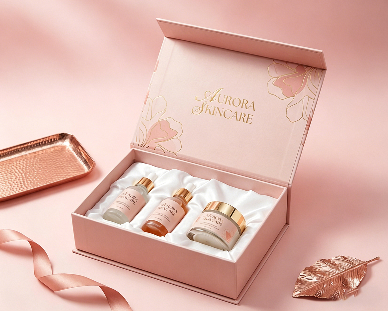
Luxury Cosmetic Packaging Structures: Choosing the Right Design
Premium cosmetic packaging relies on heavy primary materials and dense 1200–1500 GSM secondary boards to deliver immediate physical authority and protect sensitive active formulas.
Primary and Secondary Structural Dynamics
Primary containers interact directly with the formulation while secondary layers establish the initial physical touchpoint. 차이점 이해 1차 및 2차 포장 helps brands match chemical barrier requirements with rigid outer protective shells and create a more complete luxury packaging system.
- Primary Containers: Heavy-bottom glass, airless pumps, and dense zamac components shield sensitive formulations while offering comfortable daily handling.
- Rigid Outer Boxes: Specifying 1200 에게 1500 GSM rigid chipboard ensures absolute structural integrity and high-impact physical presence.
- Unboxing Mechanics: Magnetic flaps, drawer slides, and book-style folds establish a controlled, multi-stage ritual that builds anticipation.
Brands must design these layers as a unified system. When the outer box matches the exact weight and alignment of the primary bottle, the consumer registers the physical cohesion before testing the product.
무게, Precision, and Tactile Engineering
Physical heft subconsciously signals value. High-end packaging utilizes physical density and micro-tolerances to differentiate from mass-market plastic containers.
- High-Density Materials: Thick-walled glass bases and cold-touch metal accents add instant physical mass, associating the container with premium quality.
- Precision-Fit Inserts: Die-cut EVA foam, shaped molded pulp, and velvet or satin-wrapped trays secure products tightly to prevent rattling during transit.
- Refillable Systems: Designing durable, collectible outer shells with easily swappable inner pods reduces material waste while keeping the primary object on the vanity.
Usability and sensory feedback must guide these choices. Every button click, cap friction, and cartridge swap must feel smooth and deliberate, reinforcing precision engineering during every single use.
Luxury Cosmetic Packaging Materials That Create Premium Appeal
Heavyweight substrates, cold-touch metals, and disciplined tactile finishes physically communicate product value, shifting cosmetic packaging from simple containers to high-margin sensory assets.
| 재료 | Sensory Signal | Technical Specification |
|---|---|---|
| Heavy Glass | Substantial weight, visual clarity, and base depth | Thick-bottom molding, UV-stable coloring (amber, cobalt) |
| Zamac / Metal Alloys | Cold touch, premium weight, and refined closure experience | Durable metal components with a smooth finish and precise manufacturing |
| Rigid Paperboard | Solid structural feel, 깨끗한 가장자리, premium unboxing ritual | 1200–1500 GSM chipboard wrapped in textured art paper |
Tactile Weight and Material Selection for Premium Packaging
Physical mass acts as an immediate indicator of formula value. Brands utilize heavy-bottomed glass to establish quality, purity, and product worth before the customer even applies the product. This heavy weight creates a subconscious association with permanence and higher price points.
Integrating Zamac and high-grade metal alloys delivers a distinct cold touch and a robust mechanical feel. These materials communicate engineering precision that standard plastics cannot replicate, serving as key markers of craftsmanship on caps and applicators.
- Tactile Hierarchy: Premium closures often use heavier materials, refined finishes, and precise mechanisms to create a more satisfying first-touch experience.
- Auditory Feedback: Designing closures with smooth movement and controlled opening sounds can enhance the overall premium experience.
Surface Finishes and Sustainable Materials in High-End Design
Advanced surface finishing provides physical and visual depth. Applying soft-touch coatings, deep embossing, and debossing creates a rich, textured surface that invites handling. This non-reflective aesthetic aligns with modern, quiet luxury design codes.
Combining metallic foils and strategic spot gloss emphasizes brand iconography. This focused decoration directs consumer attention to logos and key claims without introducing visual clutter or noise, preserving a disciplined layout.
- Refillable Architecture: Developing refillable packaging with durable outer shells and cost-effective inner cartridges to balance environmental responsibility with luxurious weight.
- Substrate Integrity: Incorporating certified high-weight paperboard and optical-grade PCR plastics to maintain premium clarity and structural strength.
Luxury Cosmetic Packaging Printing and Finishing Techniques
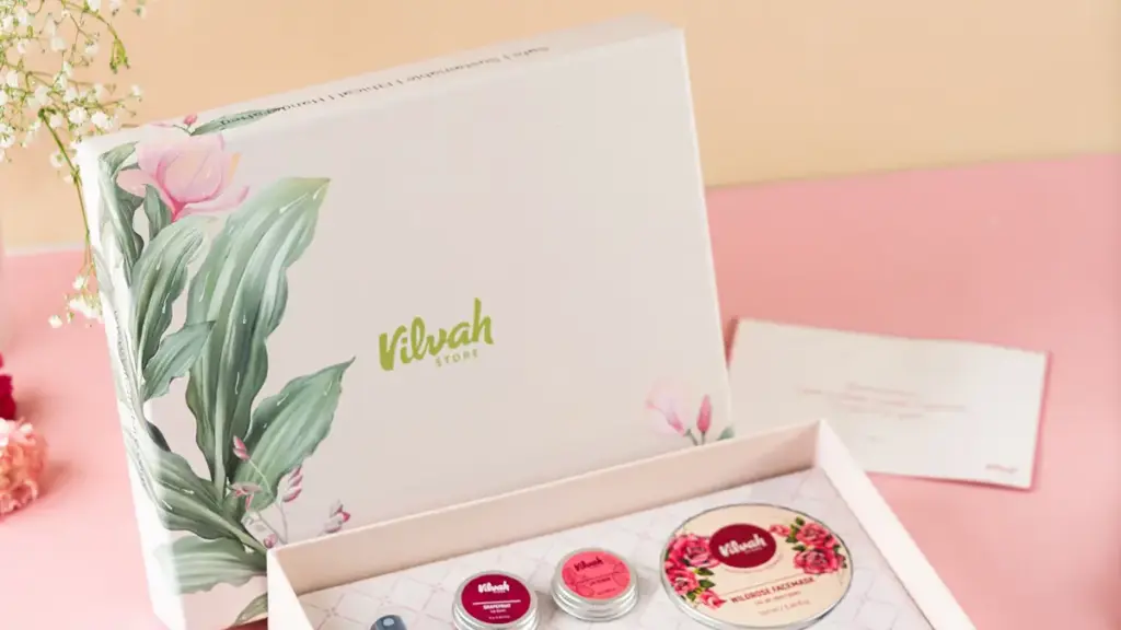
Premium finishes dictate perceived value in luxury cosmetics, but execution requires balancing tactical sensory appeal with rigorous production economics and recyclability standards.
Tactile and Visual Finishing Techniques
Decorating luxury cosmetic packaging requires a deliberate sensory strategy. Brands use visual and haptic contrasts to command retail shelf space and justify high price points. Choosing the right luxury rigid box finishing techniques can further enhance texture, visual depth, and perceived product value.
- 포일 스탬핑: Applying metallic foils to outer cartons signals immediate prestige. This process uses heat and pressure to deposit gold, 은, or rose gold highlights, evoking a jewelry-like quality.
- Embossing and Debossing: Physical tooling creates three-dimensional depth on paperboard. Blind embossing provides an understated, tactile discovery that consumers notice upon handling.
- Soft-Touch and Matte Laminations: These treatments provide a velvety, warm surface feel. They eliminate glaring reflections while shielding printed inks from retail scuffs and oils.
- Frosted and Spray Coatings: Softening primary glass or plastic containers with frosted effects conveys modern minimalism. This technique diffuses light through the container while masking minor substrate imperfections.
Implementation Economics and Sustainable Design Strategies
Deploying premium finishes requires aligning design ambition with commercial reality. High-end embellishments can quickly erode margins if specified without operational planning.
- Production Costs and MOQs: Tooling-heavy finishes like multi-level embossing or custom electroplating require significant upfront investment. These fixed costs mean low-volume production runs face steep per-unit surcharges, making them viable only for high-margin hero SKUs.
- Strategic Material Combinations: Brands can contain costs by applying premium treatments selectively. Combining a low-cost matte lamination base with a targeted spot UV or foil logo delivers the impact of a custom rigid setup box at a fraction of the cost.
- Recyclability Impacts: Heavy laminates, multi-layer plastic coatings, and dense foil coverage complicate waste processing. Shifting to mono-material structures, water-based varnishes, and restricted foil areas preserves the recycling stream while meeting eco-luxury market demands.
- Compatibility and Compliance: Applied finishes must undergo strict adhesion and chemical stability testing. Direct contact with active cosmetic formulas, alcohol, or essential oils can cause coatings to delaminate, bubble, or leach, risking regulatory failures.
Balancing decoration with structural integrity ensures the packaging performs consistently from the production line to the vanity.
Choosing the Right Manufacturing Partner for Luxury Cosmetic Packaging
Creating luxury cosmetic packaging requires more than an attractive concept. Brands need a manufacturing partner that can translate design ideas into consistent, production-ready packaging. packccp 완전 맞춤형 종이 포장 솔루션 제공, covering structural design, 재료 선택, 인쇄, 마무리 손질, and quality inspection. 이상으로 20 수년간의 업계 경험, our engineering team helps brands optimize packaging structures while maintaining premium appearance and production efficiency. We support customized 강성 상자, 화장품 포장 삽입물, and specialty finishes including UV printing, 포일 스탬핑, 그리고 엠보싱. By combining flexible customization, reliable quality control, and factory-direct production, PackCCP helps beauty brands create packaging that protects products, strengthens shelf presence, and supports scalable growth.
Cosmetic Packaging Design: 색상, 타이포그래피, and Brand Identity
Strategic color choices and disciplined typography elevate perceived value, driving purchase intent by communicating formula efficacy and brand prestige at first glance.
Strategic Application of Color Psychology in Luxury Cosmetics
Color serves as a critical neuromarketing tool on the retail shelf. It shapes emotional expectations, signals price positioning, and communicates product benefits before a customer reads a single claim.
- Color Association Strategy: Deploy industry standards like black for sophistication, ivory or warm greys for quiet luxury, and deep greens with gold foil for premium eco-luxury.
- Functional Alignment: Map packaging hues to formula benefits, utilizing orange tones for brightening Vitamin C serums and aqua shades for hydrating formulas.
- Palette Restraint: Restrict the packaging palette to one primary brand color, one secondary color, and one strategic accent to maintain minimalist restraint and avoid visual clutter.
- Tactile Tone Combinations: Combine muted, low-saturation tones with tactile matte finishes, applying spot UV gloss or metallic foils selectively to emphasize high-value focal elements.
Aligning packaging colors directly with target emotional responses and price positioning influences buying decisions and justifies the premium pricing of high-end lines.
Typography Strategy and Layout Design for High-End Packaging
High-end typography establishes authority and clarifies information hierarchy on small cosmetic containers. Clean layouts rely on spatial discipline to make product details instantly readable under retail lighting.
- Font Style Selection: Select font styles that mirror brand identity, utilizing elegant serifs for heritage and authority or clean sans-serifs for clinical precision and modern minimalism.
- Typographic Hierarchy Limits: Limit packaging layouts to two font families to establish a disciplined typographic hierarchy that prioritizes the brand name and product function.
- Letter and Line Spacing: Apply generous letter-spacing and line-spacing with ample negative space to elevate perceived value and avoid crowded, lower-tier text blocks.
- Color Contrast Rules: Maintain high contrast between text and background colors, using dark typography on light matte bases or pale metallic foils on deep backgrounds for readability.
- Production Standardization: Standardize precise color and typography specifications across all manufacturing partners to prevent visual mismatches that degrade brand luxury.
Disciplined typographic layouts eliminate clutter, signaling brand confidence while ensuring essential ingredient and regulatory texts remain fully legible.
Designing a Luxury Cosmetic Packaging Unboxing Experience
A choreographed unboxing journey transforms standard product delivery into a high-margin brand ritual, leveraging sensory engineering and structural precision to solidify customer loyalty. This is why many premium beauty brands choose rigid boxes for luxury packaging when they want stronger protection and a more memorable opening experience.
Multi-Sensory Architecture and Layered Reveal Structures
Physical interaction dictates the perceived value of a cosmetic formula before application. Designing a deliberate reveal sequence builds anticipation and turns a transactional delivery into an exclusive ritual.
We require specific structural elements to orchestrate this opening flow:
- Rigid Outer Structure: Dense 1200 에게 1500 GSM greyboard prevents deformation and provides substantial hand-feel.
- 맞춤형 보호 인서트: Tailored EVA foam, 성형펄프, or satin-wrapped trays secure glass jars and orient labels facing upward.
- Layered Materials: Branded tissue wraps, custom wax stamps, and heavy secondary sleeves delay the final product reveal.
- Interactive Closures: Integrated magnets or friction-fit lids control the opening speed and physical effort.
Engaging multiple senses simultaneously reinforces brand memory. Soft-touch coatings and embossed textures offer warm, skin-like tactile cues that contrast against cold glass.
The opening process must also account for sound and scent. Eliminating crinkly plastic wraps in favor of heavy, quiet papers preserves the auditory luxury of a gentle “whoosh.” Infusing tissue liners with a subtle, non-contaminating signature scent anchors brand recognition long after the box opens.
Digital Shareability and Sustainable Eco-Luxury Practices
Modern luxury packaging must perform on camera. Smartphone lenses flatten textures, making high-contrast layouts and rich color saturation essential for driving social media shareability on TikTok and Instagram.
To optimize secondary packaging for digital channels and unboxing videos:
- High-Contrast Graphics: Strong contrast between typography and matte substrates keeps product claims legible under harsh ring lights.
- Matte Surface Laminations: Velvet-like or soft-touch coatings reduce photo glare and camera reflections during video close-ups.
- Integrated Digital Storytelling: Discreetly positioned QR codes or NFC tags link customers to application tutorials and sourcing videos without cluttering panels.
- Framed Product Layouts: Centralized insert cavities create immediate visual focal points for flat-lay photography.
High-end aesthetics do not require environmental waste. Brands now replace plastic vac-form trays with FSC-certified paperboard and biodegradable plant-based composites.
To offset carbon footprints, engineer durable outer structures that serve a second life. A rigid magnetic box or a beautifully textured wooden tray prompts the consumer to reuse the vessel as a vanity organizer, keeping the brand visible in their daily space.
Sustainable Luxury Cosmetic Packaging Design Strategies
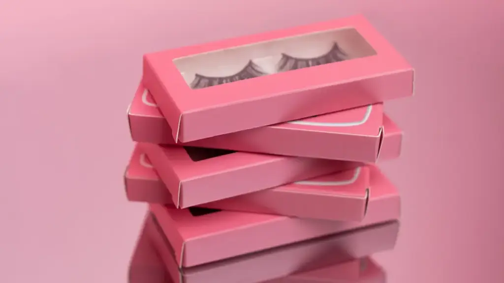
True luxury aligns high-end craftsmanship with circular design. Brands must move toward recyclable paper structures, FSC 인증 소재, mono-material solutions, and responsible packaging designs that reduce unnecessary waste.
High-Performance Eco-Materials and Design-for-Recycling Principles
Modern prestige packaging requires a shift from superficial gloss to raw material integrity. Brands maintain premium positioning by selecting noble substrates that flow back into recovery streams without losing their value or visual appeal. Exploring sustainable materials in cosmetic packaging helps brands balance environmental goals with premium design expectations.
- Substrate Integrity: We prioritize premium materials like weighted glass and brushed aluminum that support high-end sensory appeal and offer infinite recyclability.
- Surface Decoration: Designers replace heavy decorative lacquers and laminated foils with tactile finishes like embossing and debossing to prevent sorting and recycling stream contamination.
- PCR Incorporation: Brands increasingly use FSC-certified paperboard, 재활용 종이 재료, and recyclable structures to reduce environmental impact while maintaining a premium appearance.
- Fitted Inserts: Transitioning to FSC-certified rigid paperboard and compostable molded fiber inserts completely eliminates single-use plastic trays while keeping fragile bottles securely nested.
- Processing Compatibility: Enforcing mono-material constructions and wash-off adhesives ensures municipal optical sorting systems easily identify and process empty containers.
Shifting from decorative clutter to material honesty signals confidence, transforming ecological compliance into a core aesthetic asset for skincare and cosmetics lines.
Circular Refill Systems and Modern Lifecycle Operations
Designing for longevity means separating the permanent keep-safe vessel from the consumable cartridge. This architecture keeps the brand on the user’s vanity while reducing material volume over the product lifetime.
- Heirloom Vessels: Brands build durable, iconic outer containers from glass or metal, pairing them with lightweight, easily swappable plastic or glass refill cartridges.
- Economic Benefits: Refill models lower per-use material costs and increase customer lifetime value through proprietary lock-in mechanisms that discourage brand switching.
- Reverse Logistics: Implementing closed-loop return programs with pre-labeled mailing bags makes empty package returns simple and satisfying for consumers.
- Footprint Reductions: Reducing overall shipping weight and removing redundant structural layers directly decreases transport emissions and raw material costs.
- 디지털 통합: Placing discreet QR codes on outer boxes provides transparent traceability details and clear instructions for proper disposal at the end of the cycle.
This circular model changes the consumer relationship from a series of fast transactions to a continuous loyalty loop, aligning commercial goals with resource efficiency.
Luxury Cosmetic Packaging Design Mistakes to Avoid
Over-decorating, ignoring structural durability, and choosing generic off-the-shelf components instantly cheapen high-value cosmetic formulas and alienate premium beauty buyers.
Visual Overload and Sensory Disharmony in Design
Luxury packaging succeeds through restraint. Brands often make the mistake of over-decorating their products, assuming that more decoration automatically equals higher perceived value on the retail shelf.
- Finish Stacking: Combining foil stamping, 엠보싱, 스팟 UV, and glitter on a single package creates visual clutter rather than refined sophistication.
- Substrate Color Mismatch: Inconsistent color matching across paper cartons, glass jars, and plastic caps instantly betrays poor manufacturing controls.
- Panel Crowding: Filling the front display panel with excessive claims, badges, and chaotic typography sacrifices clean visual hierarchy and legibility.
- Flimsy Substrates: Choosing low-caliper paperboard below 350 GSM or generic unboxing layers deprives the customer of a premium tactile identity.
True luxury relies on sensory harmony. When colors clash across different materials, or when too many decorative finishes compete for attention, the product loses its premium authority.
Structural Inefficiency and Functional Failure in Real-World Use
Packaging must work flawlessly in everyday routines. A beautiful container becomes a liability if the customer struggles to dispense the formula or receives a damaged shipment.
- Generic Commodity Tooling: Defaulting to stock shapes and loose-fitting plastic inserts makes high-value formulas look cheap and easily replicable.
- Compromised Ergonomics: Prioritizing pure aesthetics over daily usability results in awkward droppers, leaky pumps, or fragile formats that frustrate users.
- Deceptive Carton Sizing: Creating oversized boxes with excessive empty space increases volumetric shipping costs and allows the product to rattle during transit.
- Skipped Validation Protocols: Ignoring compatibility tests, 성능 저하, and sustainable design rules leads to leaking or degraded products before retail delivery.
Luxury brands build reliability directly into the structure. Perfect tolerances, custom-fit inserts, and rigorous testing ensure the unboxing experience remains pristine from the warehouse to the consumer’s vanity.
자주 묻는 질문
What physical and visual elements make cosmetic packaging feel genuinely luxurious?
Physical weight, tactile finishes, and visual restraint define luxury. Substantial materials like thick-base glass and metals provide a satisfying weight in the hand. Tactile finishes, including soft-touch laminates, 엠보싱, and debossing, create sensory depth. Visually, luxury relies on minimalism—clean typography, neutral colors, and generous negative space that signal confidence and exclusivity.
Which coating and finishing combinations offer the highest return on perceived value?
A highly effective combination pairs soft-touch matte lamination with spot gloss UV on the logo and a subtle metallic foil accent. This approach costs only about $0.14 에게 $0.19 extra per unit but makes a standard folding carton feel like a custom rigid box, improving shelf presence and strengthening premium brand perception.
How do premium brands balance sustainability with luxury packaging expectations in 2026?
Brands focus on ‘lightweight luxury’ and refillable ecosystems. They engineer glass and metal components to reduce material mass while maintaining a premium hand-feel. 고품질, durable outer containers serve as keepsake items, while lightweight, recyclable cartridges or pouches handle the refills. This strategy lowers environmental impact while preserving the ritual of luxury unboxing.
How much does luxury cosmetic packaging cost?
Luxury packaging costs vary significantly depending on the packaging structure, 재료, 마무리 기술, 사용자 정의 수준, 및 주문 수량. Premium folding cartons with specialty finishes typically cost more than standard cartons, while custom rigid boxes with magnetic closures, premium papers, and protective inserts require a higher investment due to their complex structure and manufacturing processes.
What major packaging design mistakes should high-end beauty brands avoid?
Brands must avoid generic stock packaging, flimsy materials, and visual clutter. Cluttering the container with excessive claims and fonts immediately cheapens the product. Poorly engineered pumps that clog, caps that rattle, or leaky droppers frustrate the consumer and ruin the premium experience, regardless of how good the formula is.
최종 생각
While stock packaging offers lower upfront costs, custom structural design, 프리미엄 종이 소재, and refined finishing techniques help luxury beauty brands create packaging that protects products and strengthens brand perception. Investing in premium substrates converts your physical vessel from a basic container into a high-margin brand asset that justifies prestige pricing. Your product’s physical presence on the shelf and vanity directly determines long-term customer loyalty and repeat purchases.
Do not risk your brand launch on unverified materials. We recommend starting with a custom sample to evaluate your packaging structure, 종이 재료, 인쇄 효과, and finishing options before mass production. 엔지니어링 팀에 문의하세요 to develop premium cosmetic packaging solutions tailored to your brand requirements.